minimalist phone® Screen Time
- 4.7
- Rating
- 5.00M
- Installs
- Free
- Price
 Analysis by App-foxy
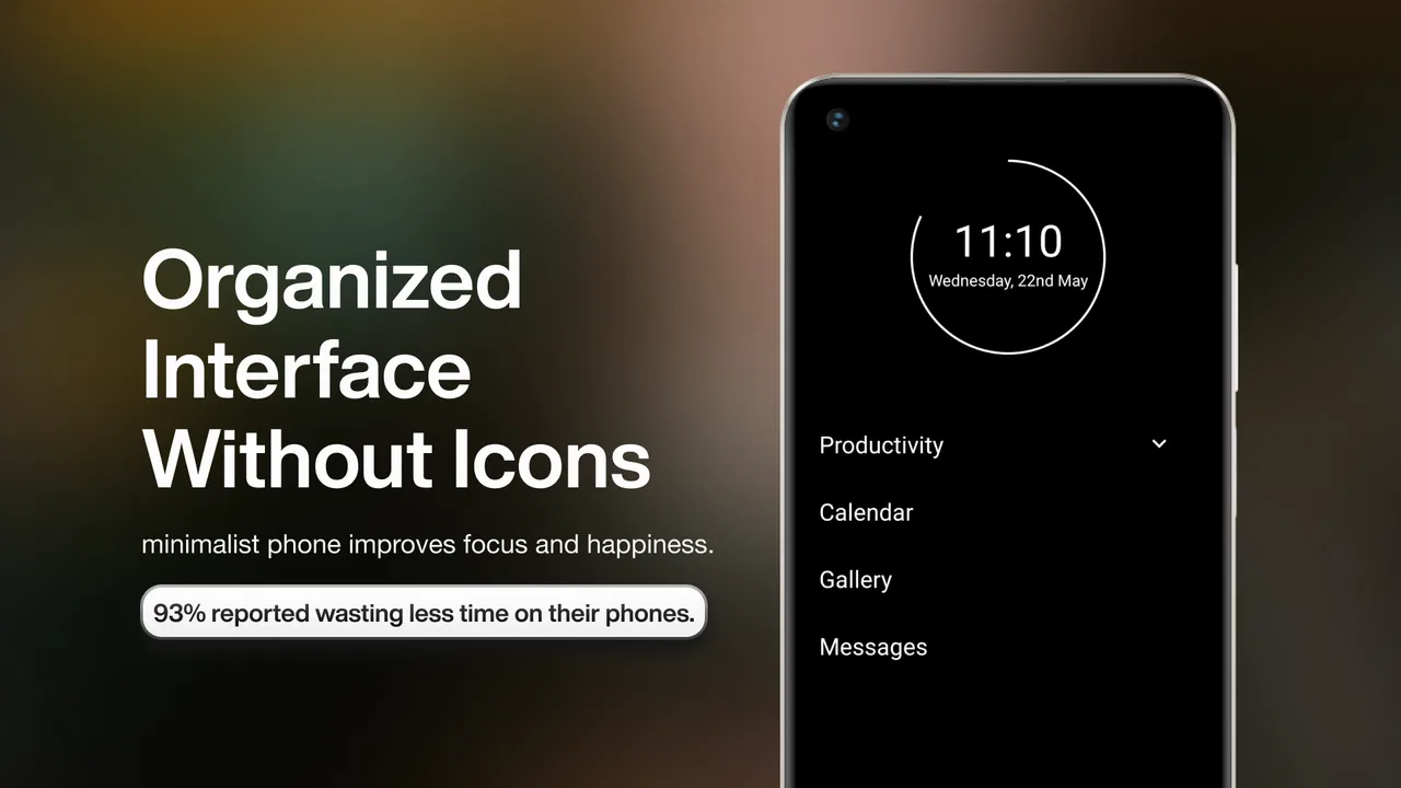
I installed minimalist phone® - Launcher expecting a simple visual change, but its real purpose became clearer after using it through ordinary household routines. This is an Android productivity app from Focus Experts that replaces the usual busy home-screen experience with a quieter, more deliberate starting point. Instead of encouraging me to browse, swipe, and open whatever catches my eye, it makes the phone feel more like a tool I pick up for a reason.
That difference matters even more when a phone is shared occasionally, passed to a child for a specific task, or used by several people in the same home. A less distracting screen can reduce accidental browsing, but it does not magically create separate accounts, family supervision, or household rules. I found the app most useful when everyone agreed on what the phone was for. The launcher supports that agreement; it cannot replace it.
How the launcher changes a shared phone experience
On a personal phone, a colorful home screen can quietly turn a short task into a long session. On a device used by a partner, teenager, parent, or guest, that effect becomes harder to predict because each person brings different habits. The minimalist layout gives the device a more neutral feel. It is easier to hand over a phone for calling, checking a message, or opening a necessary app without presenting a wall of attention-grabbing icons.
You May Also Like

 Blood Strike: 2.5 Anniversary
Blood Strike’s Loadouts Turn Every Drop Into a Tactical Gamble
A close look at Blood Strike’s custom loadouts: how fast access to signature weapons reshapes its battle royale rhythm, rewards preparation, and narrows the gap between fights.

 Pandora - Music & Podcasts
Pandora’s Music Is Easy to Start, but Harder to Recover
Pandora’s strength is its low-effort path from a seed to a station. Its weak spot is how much confidence it asks you to place in connection, setup, and quiet recovery.

 8 Ball Pool
 Is Built on Rivalries, Rematches, and Routine
A close look at the rivalries, rematches, shared routines, and unanswered safety questions that turn a quick pool match into a persistent mobile community.

 Samsung Music
’s Quiet Strength Is Playing What You Already Own
Its reach comes less from spectacle than from dependable access to a personal library. That simplicity is both the app’s strongest retention engine and its ceiling.

 AccuWeather: Weather Radar
AccuWeather Review: A Quick, Clear Forecast for Everyday Decisions
For everyday plans, the best forecast is the one you can understand quickly. AccuWeather makes rain timing, radar, and local conditions easy to act on, with a few trade-offs.

 Hill Climb Racing
Why Hill Climb Racing Still Turns Crashes Into One More Run
A tiny car, a bumpy hill and one more upgrade: Hill Climb Racing keeps resurfacing because its simple chaos makes every near-miss feel personal.
More From Our News Desk



I particularly liked this in situations where the phone had one practical job. Imagine a household keeping an older Android phone in a common area for calls, delivery updates, music, or emergency contact. With a conventional launcher, the device can gradually become another entertainment screen. With this launcher, the first impression is calmer, and the intended use is easier to explain: choose the needed tool, finish the task, and put the phone down.
That is not the same as locking the device into one purpose. The app is a launcher, not a complete shared-device management system. Anyone who can reach the normal Android app list or settings may still have access to the phone’s broader functions, depending on the device configuration. For a genuinely communal phone, I would still establish a clear routine about which apps are appropriate and who is responsible for changes.
The app’s grayscale approach also contributes to that shared feeling. Color is useful for recognition, but it can make entertainment apps and notifications visually loud. Removing much of that stimulation makes the screen less personal and less persuasive. I would not describe the result as exciting, and that is precisely the point. The strongest benefit is not better organization; it is reducing the number of reasons to keep looking at the screen.
Setting boundaries before handing over the phone
The most important setup decision is not cosmetic. Before introducing the launcher on a shared device, I would decide what the phone should do and what it should not become. If the device is for calls and practical coordination, keep the home screen centered on those needs. If it is mainly for an older relative, prioritize the apps and contacts that person already understands. If a teenager borrows it for transport or communication, make the expectations clear before relying on the calmer interface.
This approach avoids a common mistake: treating a minimalist appearance as proof that the phone is automatically safe or distraction-free. The launcher can make temptation less immediate, but it does not judge whether an app is suitable for a particular person. It also does not remove the need to discuss notifications, account access, or the difference between a shared device and a private one.
I found it helpful to test the phone from another person’s perspective after setup. Could a guest find the dialer without asking? Would a family member recognize the apps they need? Is the device still usable when someone is in a hurry? Minimalism should remove clutter, not create uncertainty. If the simplified layout makes an essential action harder to discover, the setup has gone too far for that household.
There is also a practical boundary around settings. A launcher changes the front door of Android, but it does not turn the operating system into a separate environment. I would not give this app responsibility for protecting private accounts or preventing changes. Those concerns belong to Android’s own user and security tools, along with the household’s agreement about who can adjust the phone.
For a personal device, this limitation is usually manageable. For a shared one, it is central. A parent looking for detailed supervision, a workplace needing managed access, or a family wanting independent profiles should look at system-level tools or a device designed for that purpose instead. This app is better at shaping behavior than enforcing boundaries.
Coordinating calls, messages, and everyday tasks
The launcher becomes more valuable when the household treats the phone as a coordination point rather than an entertainment hub. I can imagine leaving a device near the entrance for delivery calls, school pickup arrangements, appointment reminders, or contact with relatives. A quieter home screen makes it easier to remember the phone’s role and less likely that someone will open it merely out of habit.
One useful workflow is to agree on a small group of essential apps and place them where they can be found without explanation. The goal is not to create a perfect layout for every user. It is to create a predictable one. A partner should know where to look for messages, a parent should know how to call, and a visitor should not need to explore every screen to complete a simple task.
This predictability is especially helpful when several people take turns using the same handset. A conventional launcher often reflects the preferences of the person who configured it, with folders, widgets, and frequently changing icons. A minimalist arrangement can feel less like someone else’s personal dashboard. That reduces friction, although it may also remove shortcuts that experienced users rely on.
I would be cautious about using a shared phone for sensitive conversations. A simple launcher does not separate one person’s messages from another person’s, and it does not create account boundaries by itself. If multiple household members need private communication, separate devices or proper Android account arrangements are a better answer. The visual simplicity is useful for coordination, but privacy still depends on the underlying device and accounts.
Another trade-off appears with notifications. A less stimulating screen can make alerts feel less intrusive, but a household still needs a way to distinguish urgent communication from background noise. I would review notification habits separately rather than assuming the launcher solves them. If every app continues to send alerts, the home screen may look calm while the phone remains disruptive in practice.
That is one of the app’s less obvious lessons: screen-time reduction works best when the launcher is paired with a shared routine, not when it is treated as a single switch. Turning off unnecessary alerts, agreeing on charging locations, and deciding when the phone is put away can make the visual change much more effective.
Age, trust, and the difference between guidance and control
The Everyone content rating makes the app broadly approachable, but age suitability in a household is about more than whether the launcher itself is acceptable. A young child, an older adult, and a teenager may all use the same simplified screen while needing completely different levels of guidance. The app can make the interface less overwhelming, but it does not understand the user’s age, judgment, or circumstances.
For an older relative who finds modern home screens confusing, the reduced visual noise may be reassuring. I would still walk through the important actions in person and make sure the device remains readable and familiar. Removing clutter is helpful only if the remaining choices are recognizable. A minimalist interface should support confidence, not make someone feel that useful functions have disappeared.
For a child, I see the launcher as a conversation aid rather than a control mechanism. It can support a household rule such as “this phone is for contacting us and completing school tasks,” but it does not independently enforce that rule. Parents who need app restrictions, activity supervision, or separate permissions should use tools intended for those purposes. Choosing this launcher alone would create a false sense of security.
Teenagers present a different question. They may appreciate a calmer phone if they are trying to reduce distraction, but they may also find the restricted-feeling appearance patronizing if it is imposed without discussion. I would offer it as a shared experiment: use the simpler setup for a week, identify what genuinely helps, and change it if essential tasks become awkward. Trust matters more than forcing a particular home screen.
The same principle applies to partners and roommates. A shared device should not become a way to monitor another person’s behavior. The launcher is appropriate when everyone understands its purpose and agrees to the arrangement. It is not appropriate as a substitute for consent, private accounts, or honest communication about phone use.
What daily use feels like compared with regular launchers
Compared with the standard launcher that comes with an Android phone, this app feels intentionally less flexible and less visually rewarding. Stock launchers usually offer widgets, changing wallpapers, notification badges, and quick access to a large collection of apps. Those features are convenient, but they also turn the home screen into a constant stream of prompts. The minimalist approach gives up some convenience to make the first screen less demanding.
Compared with a conventional productivity launcher, its appeal is more focused. Many productivity launchers still emphasize customization, detailed statistics, task panels, or elaborate organization. Those tools can be excellent for someone who enjoys tuning a system. I prefer this app when I want fewer decisions. It does not ask me to maintain a complex productivity dashboard before I can benefit from it.
That simplicity has limits. Someone who depends on multiple widgets, calendar visibility, specialized shortcuts, or a highly personalized work layout may feel slowed down. The app is not a replacement for a full task manager, calendar, parental-control suite, or multi-user environment. It changes how I approach Android; it does not provide every productivity function I might want.
The grayscale presentation is also a matter of taste and accessibility. I found it calming, especially during short checks, but some users rely on color to distinguish apps quickly. If color coding is important for work, navigation, health, or communication, a fully monochrome appearance may create extra mental effort. I would test the launcher during a normal day rather than judging it from the first five minutes.
There is a useful trade-off between speed and intention. A regular launcher often helps me reach a familiar app instantly. This one encourages me to notice why I am unlocking the phone. That can reduce impulsive use, but it may feel irritating when I am repeatedly handling the same work task. For a personal phone, I would keep it if my main problem were habitual checking. For a work-heavy phone, I would compare the friction against the benefit honestly.
Version, compatibility, and the cost of trying it
The app is free to install, which makes experimentation straightforward. Optional in-app purchases range from around thirty cents to about sixty dollars per item, so I would review any purchase screen carefully before paying for extras. The free entry point is useful for a household that wants to test the idea on one device before changing everyone’s setup.
It runs on Android six and later, making it relevant to some older phones that may no longer feel comfortable with newer, more feature-heavy software. The current version is 1.20.1v217. I would still check how the launcher behaves on the specific handset, because Android manufacturers can handle default launchers, gestures, permissions, and settings differently.
Changing a launcher is not a permanent commitment, but it can affect daily habits quickly. Before installing it on a shared device, I would note how to return to the previous launcher and make sure the household knows where essential settings are located. That small preparation prevents confusion if someone decides the simplified layout is not suitable.
Focus Experts has built the app for a clear productivity purpose, and the strong reception is consistent with that focused idea: it holds an average rating of 4.5 from around forty-seven thousand ratings, with over five million installs. Those figures suggest that the concept has reached a substantial audience, but they should not decide the household fit for you. A launcher can be popular and still be wrong for someone who needs dense information or advanced customization.
Who should use it, and who should choose something else
I would recommend it to someone who unlocks their phone without a clear reason, to a household trying to make a common device less tempting, or to an older Android phone that needs a calmer purpose. It is also a good fit for people who dislike configuring elaborate productivity systems. The app’s best quality is that it makes restraint visible without requiring a complicated method.
I would hesitate to recommend it to a family seeking real parental controls or independent profiles. It does not turn one phone into several private spaces, and a simple home screen should not be mistaken for account separation. I would also steer heavy multitaskers toward a more conventional launcher if widgets, shortcuts, and rapid app switching are central to their work.
People who need strong visual color cues should test the grayscale experience carefully. Likewise, anyone sharing a phone across very different ages should prioritize clarity and accessibility over the appearance of minimalism. The right question is not whether the screen looks clean; it is whether every intended user can complete important tasks confidently.
For a household trial, I would start with one device and one clearly defined purpose. Use it for calls and coordination rather than changing every phone at once. After several days, ask whether people are finding necessary tools faster, whether fewer casual checks are happening, and whether anyone feels blocked by the layout. Those answers are more useful than a promise of total digital detox.
My household verdict
After using minimalist phone® - Launcher, I see it as a behavioral nudge with unusually practical value for shared routines. It makes a phone feel less like a personal entertainment center and more like a deliberately configured tool. That can help a household coordinate calls, reduce casual checking, and give an older or less confident user a calmer starting point.
Its boundaries are just as important as its strengths. It does not provide private account spaces, detailed supervision, or guaranteed control over everything available on Android. It also trades away some convenience and visual recognition in exchange for fewer distractions. Those are not flaws to hide; they are the terms of using it.
My recommendation is to try it when the household wants a simpler relationship with one Android phone and is prepared to agree on the device’s role. Keep expectations realistic, test the layout with every regular user, and handle privacy or child-safety needs with the appropriate system tools. If that sounds like the goal, this free productivity app is a sensible experiment. If the real need is management rather than minimalism, a dedicated solution will serve you better.
FAQs for minimalist phone® Screen Time
01What is Minimalist Phone® - Launcher?
Minimalist Phone® - Launcher is a streamlined and intuitive launcher designed to enhance your smartphone experience by focusing on simplicity and productivity. It offers a clutter-free interface that prioritizes essential functions and reduces distractions, making it ideal for users looking to improve their phone's usability and efficiency.
02Is Minimalist Phone® - Launcher compatible with my device?
Minimalist Phone® - Launcher is compatible with most Android devices running Android 5.0 (Lollipop) and above. However, to ensure optimal performance, it is recommended to have a device with at least 2GB of RAM and a recent Android version. Always check the app's page for the latest compatibility details.
03What features does Minimalist Phone® - Launcher offer?
Minimalist Phone® - Launcher provides features like customizable home screens, a focus mode to minimize distractions, and a simple app drawer for easy navigation. Users can also enjoy widgets, shortcuts, and a clean interface, which helps in boosting productivity by allowing easy access to essential tools.
04Does Minimalist Phone® - Launcher affect battery life?
Minimalist Phone® - Launcher's lightweight design is optimized to have minimal impact on battery life. By reducing resource-intensive animations and focusing on essential functionalities, it aims to enhance performance and extend battery life compared to more elaborate launchers. However, actual battery consumption may vary based on individual usage patterns.
05How can I customize my layout in Minimalist Phone® - Launcher?
Customizing your layout in Minimalist Phone® - Launcher is straightforward. Users can adjust their home screen by selecting and placing widgets, apps, and shortcuts to suit their preferences. The app provides a range of minimalist themes and icon packs, allowing users to personalize their phone's appearance while maintaining a clean and organized look.
Pros
- Streamlined user interface enhances focus.
- Customizable themes for personalization.
- Low battery consumption saves energy.
- Quick access to essential apps.
- Minimal distractions improve productivity.
Cons
- Limited widget options reduce flexibility.
- Lacks advanced customization features.
- No support for third-party icon packs.
- May not suit feature-rich app users.
- Basic design may feel too simplistic.

minimalist phone® Screen Time
Gallery